
Logo

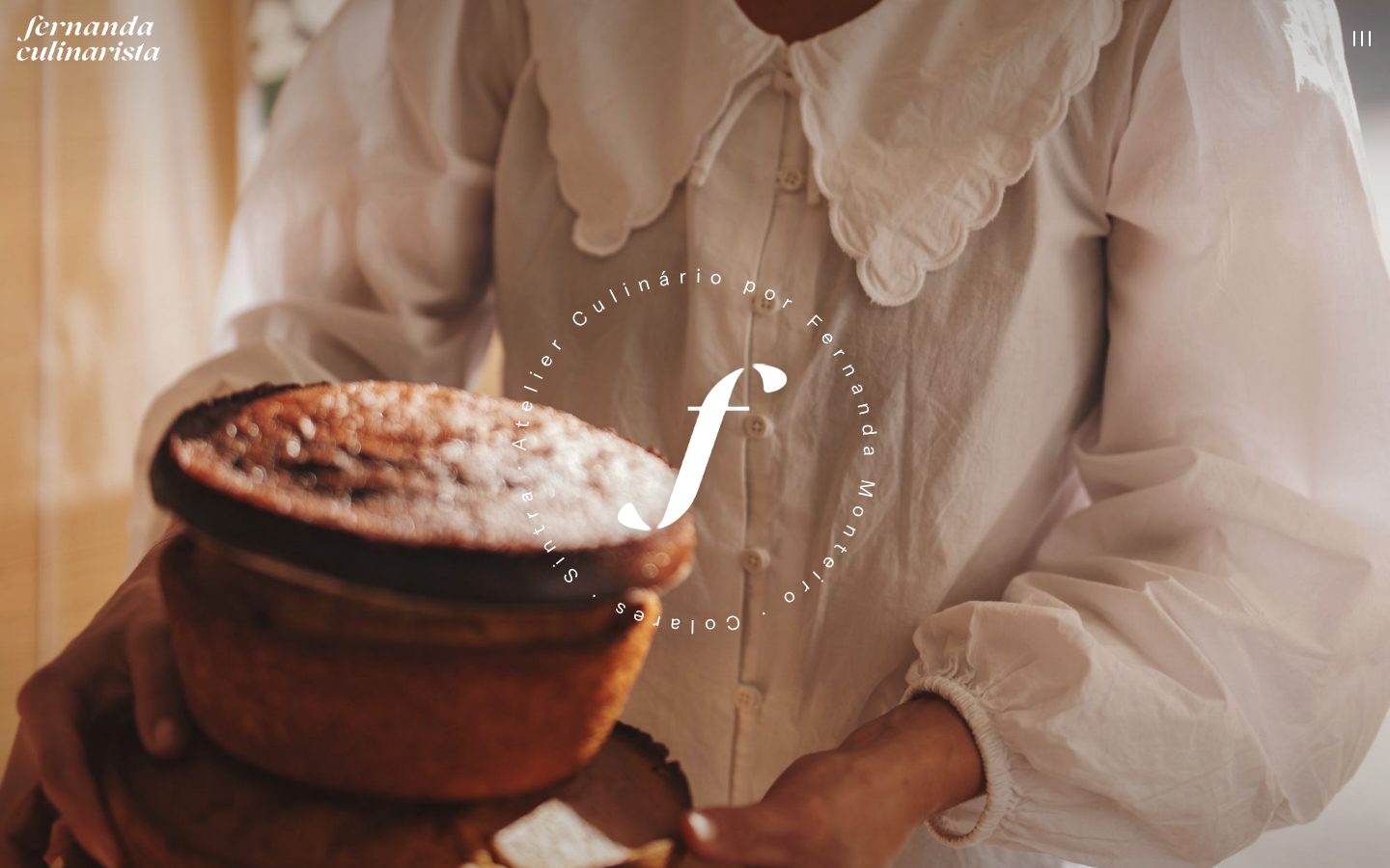
Her own wordmark replaces the deck’s “Bons”. The italic f stands in wherever the full name won’t fit: favicon, seal, stickers.
Case study · Brand & website
Fernanda bakes from a small shop in the middle of Colares. She came to us with a brand deck built around a name that wasn’t hers. We kept what already felt like her — the palette, the hand-drawn bakes, the poster series — put her own wordmark back in the middle, and built a site that works like the shop: photo first, one line at a time, orders straight to WhatsApp.
Moodboard
Colour palette
Her own wordmark replaces the deck’s “Bons”. The italic f stands in wherever the full name won’t fit: favicon, seal, stickers.
bolos, tartes e cafés
Bolo à fatia, bolos decorados e encomendas para todos os dias.
TER–DOM · 8H–19H
Web stand-ins for the deck’s Ivy Presto and Geneva, picked to hold the same shapes. One typeface per word, never split.
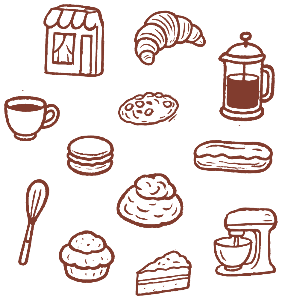
Twelve drawings lifted as vectors from the deck. On the site they trace their outline before filling in, and turn up in a few places only: the menu, the order list, the wedding steps.
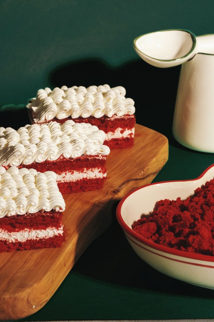
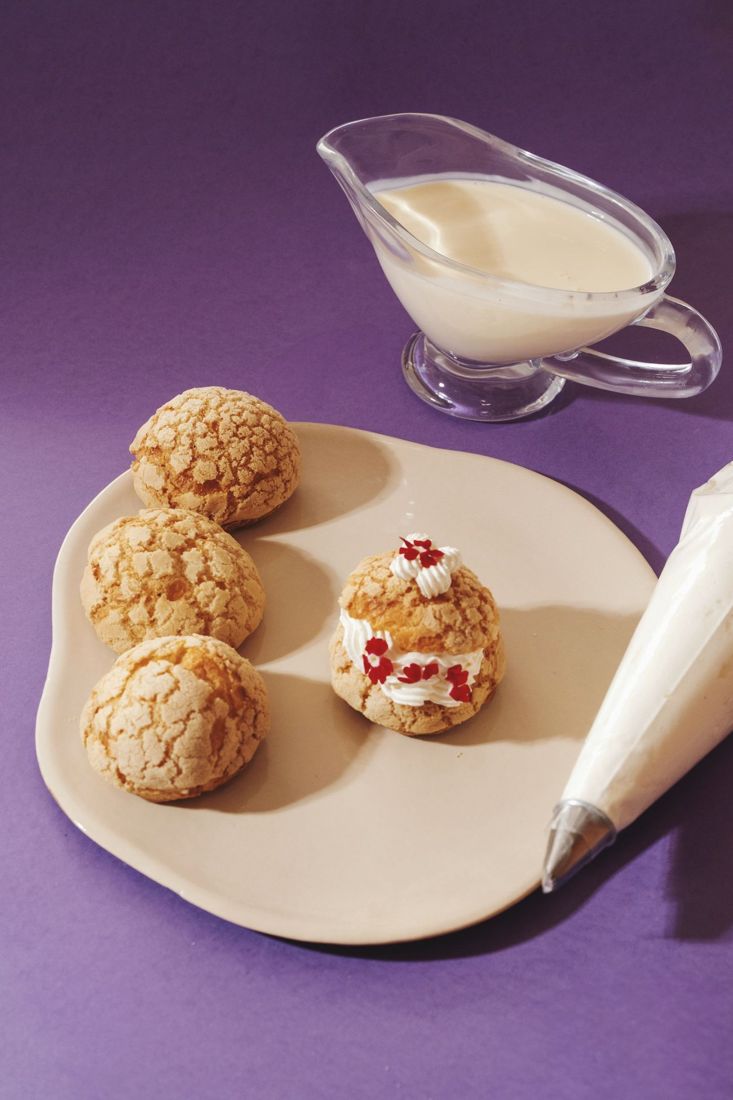
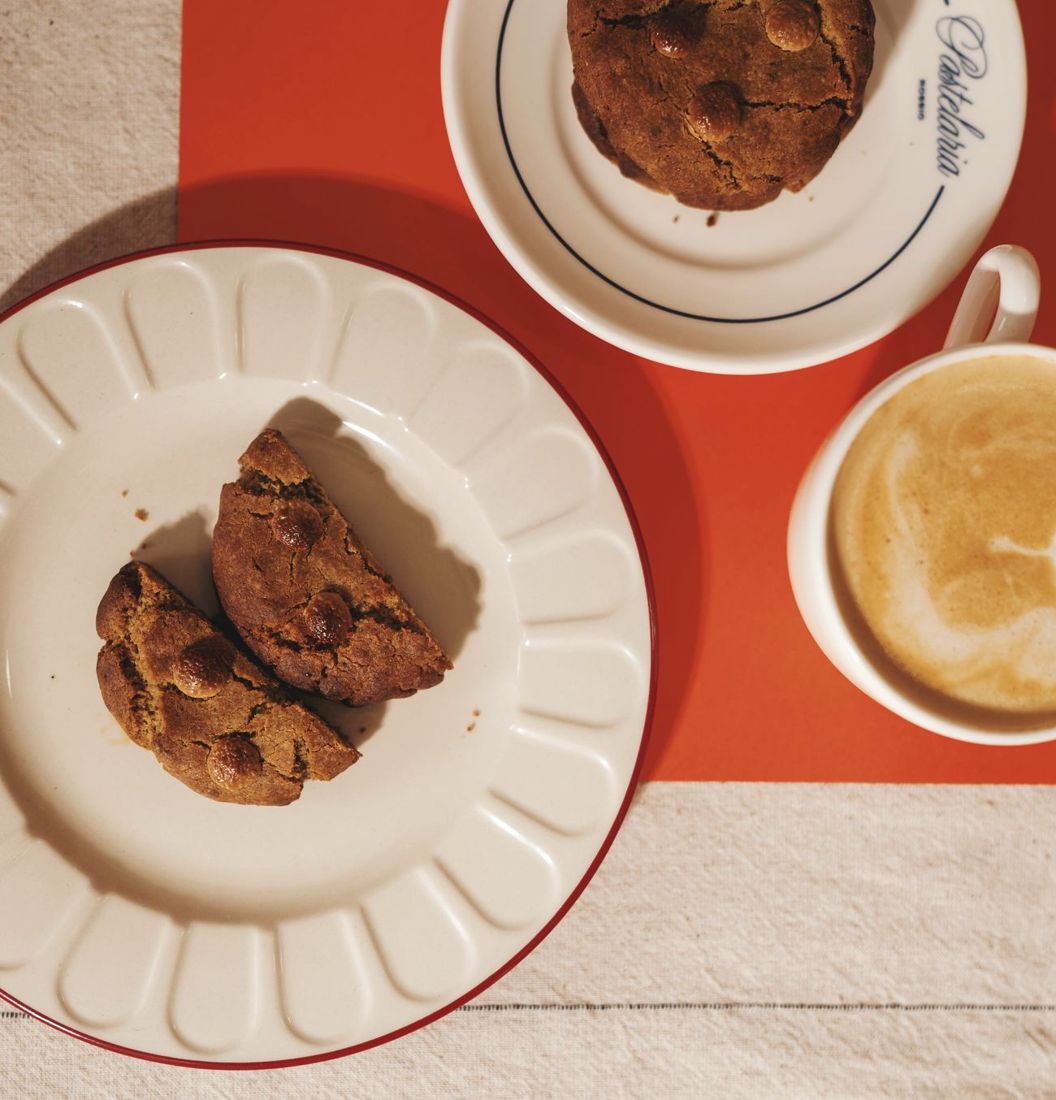
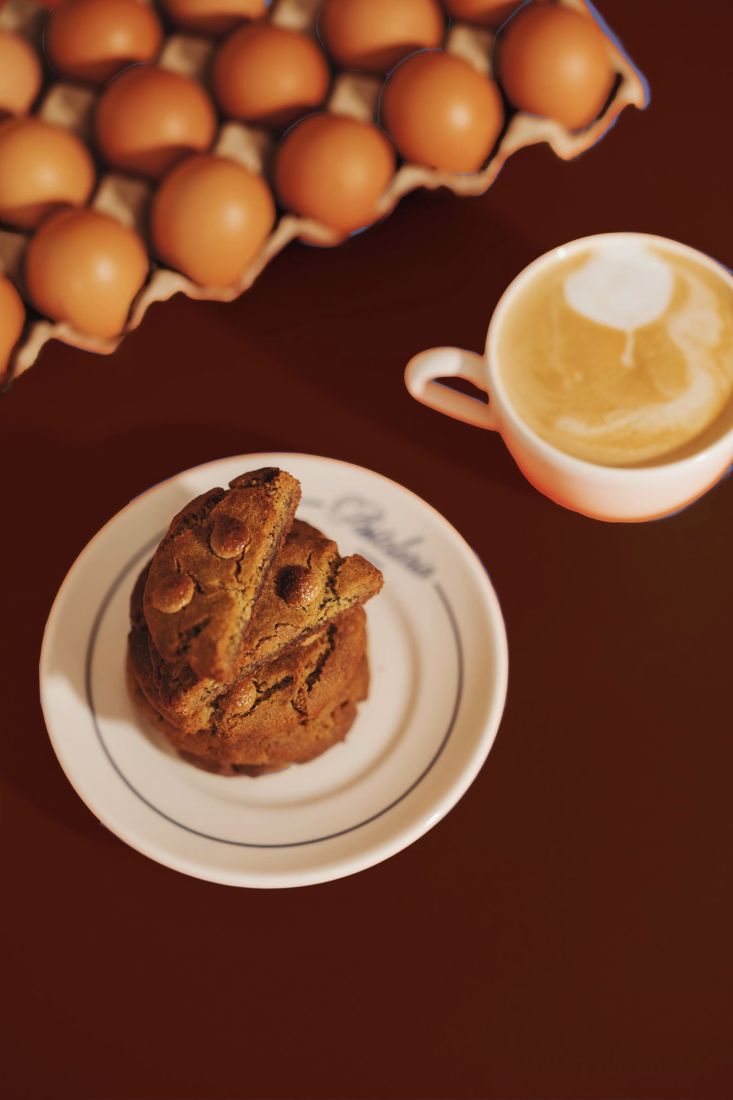
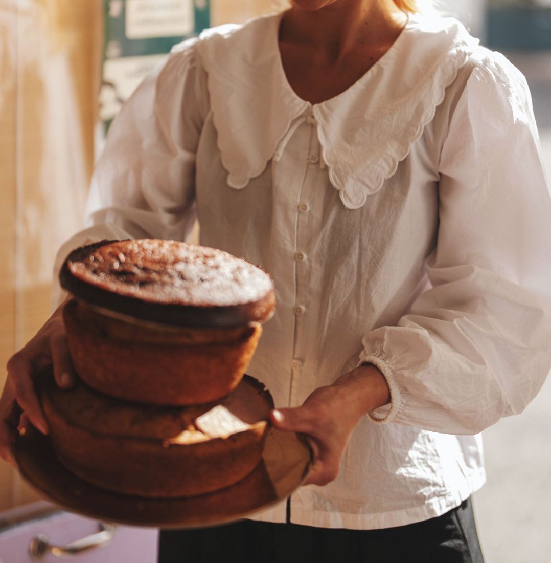
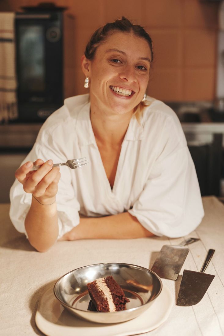
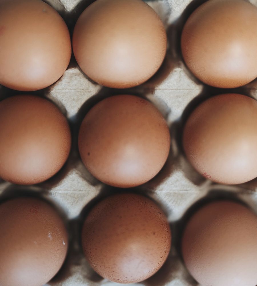
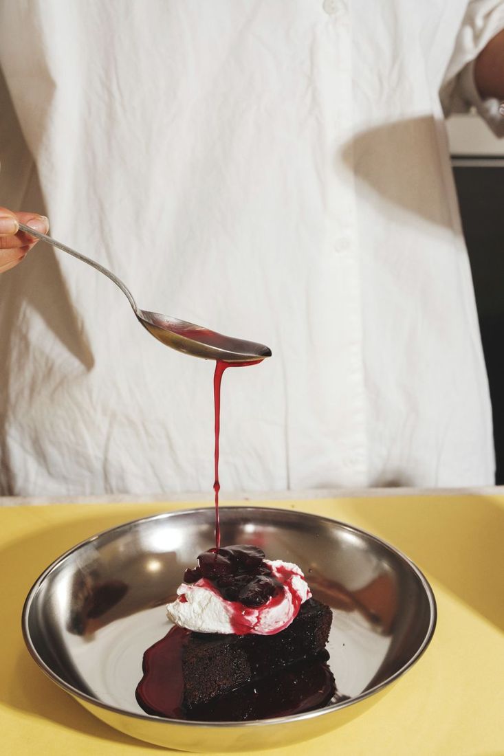
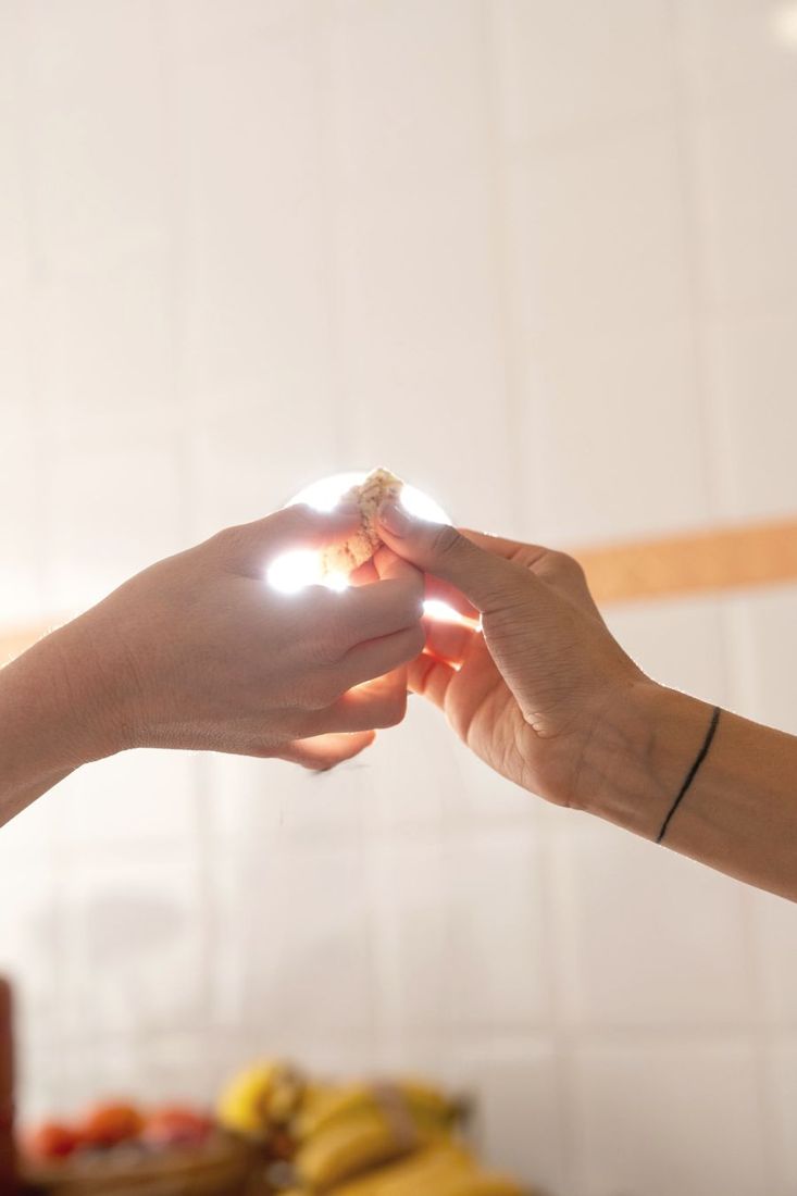
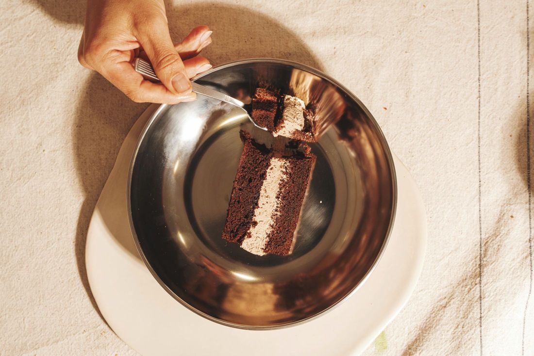
Warm, close and a little flash-lit. Coloured grounds pulled straight from the palette, so every photo already sits in the brand.
Poster series
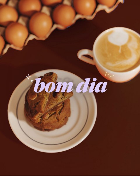
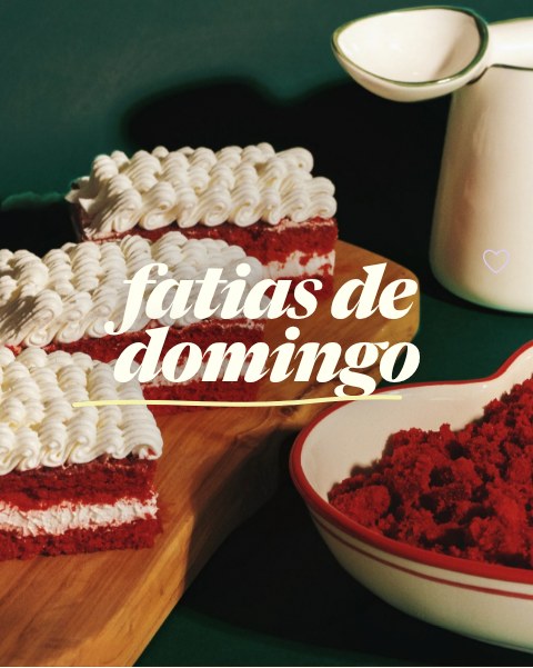
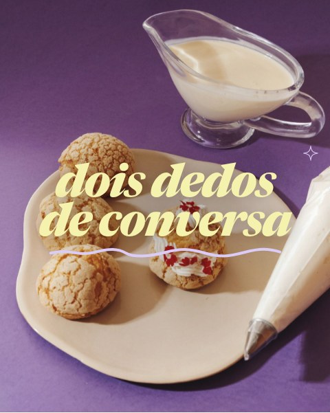
A brand deck built around someone else’s name, and a business that lived on Instagram and WhatsApp.
Her wordmark back on everything. A site that reads like a wall of her posters, with a wedding section that doesn’t take over.
Orders and wedding enquiries arrive in WhatsApp, already written. Her Instagram feeds the gallery, so the site stays current on its own.
On the page
 a cartaA full-screen card that flips over to show the menu.
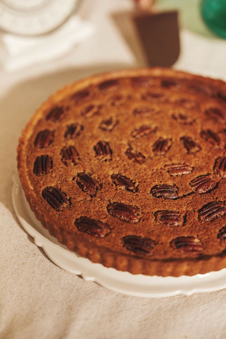
 hoje temToday’s tartlets as a ruled list, one drawing per bake.
 bolos de casamentoFour steps from first message to the day, ending in a tasting.